Sign In
 Create Account

 Find content
 Male
Male


 Posted by
 Thanks to all who participated in this week's editing exercise. Some interesting interpretations.
Bart, I like sharp rocks on your image and your overall conversion to b&w. I think rocks really come to life and the sea just fades in the background.
deano, I like your interpretation as well. It reminds me of an old movie scene with much softer approach than Bart's.
Peter, If Bart's interpretation highlights the rocks, I think yours highlights the sky with very gentle and soft colors. I would just add a little bit of light on the rock and that would be it. I hope you don't mind me saying (writing) that.
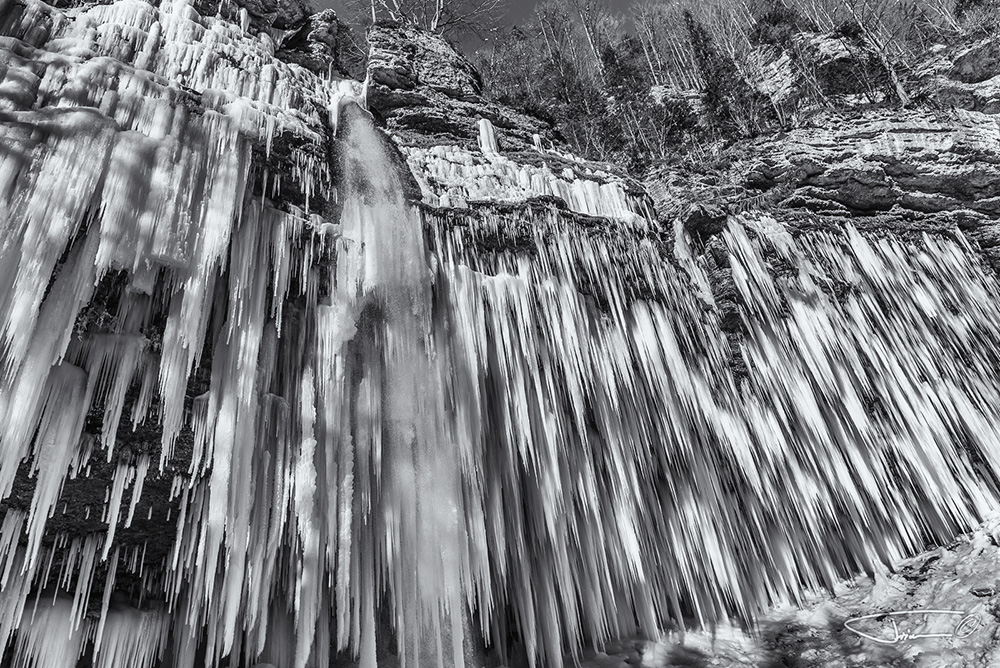
As I wrote, I had some issues with this image. Being very busy at work at the moment, here is my take on this image:
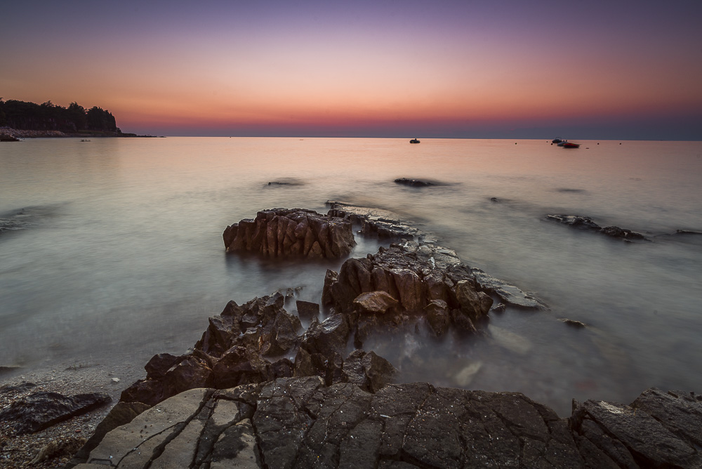
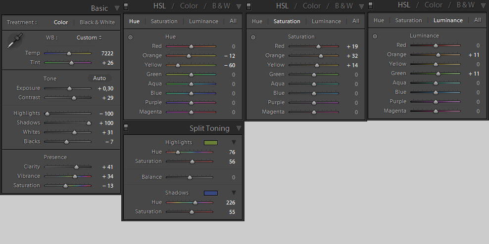
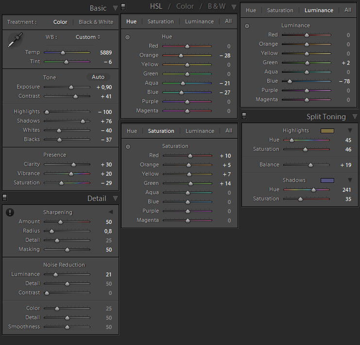
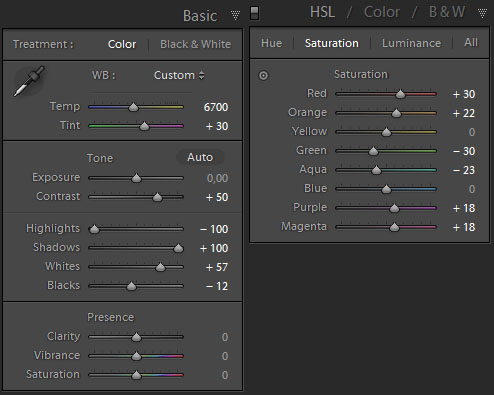
I applied these settings:
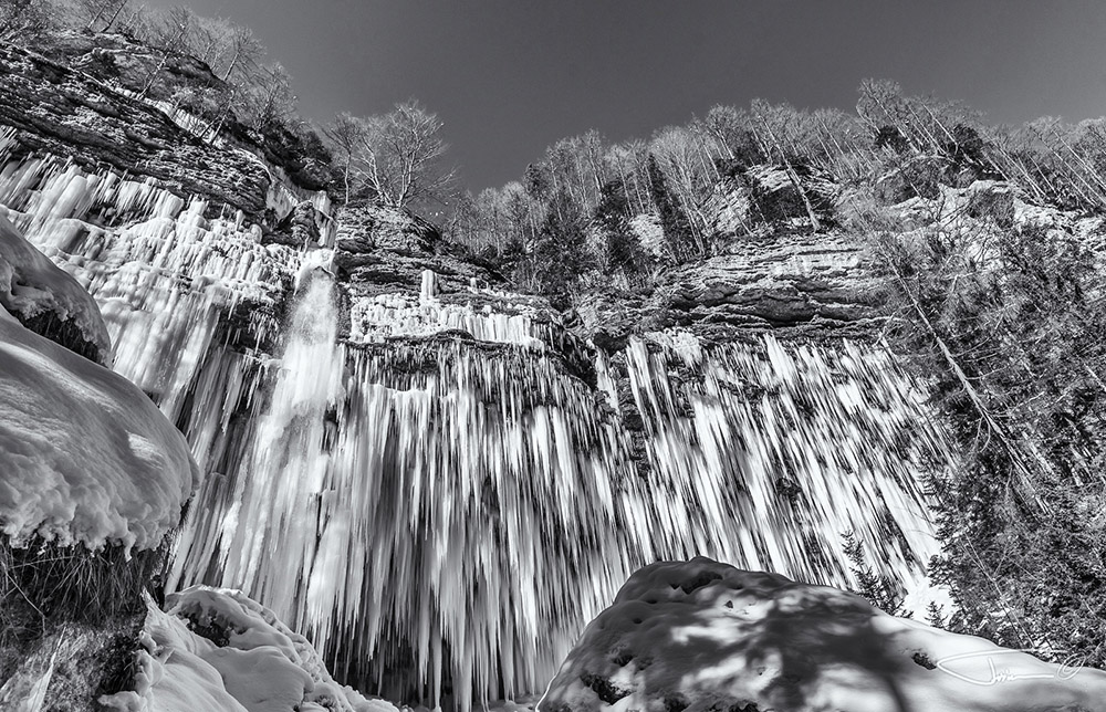
I also added graduated filter on the top and bottom of the image and added some highlights on the rocks.