Jump to content

Welcome to NikonForums.com
Register now to gain access to all of our features. Once registered and logged in, you will be able to create topics, post replies to existing threads, give reputation to your fellow members, get your own private messenger, post status updates, manage your profile and so much more. If you already have an account, login here - otherwise create an account for free today!
Photo

First time looking for critique


  • Please log in to reply
15 replies to this topic

#1
pebbleheed

pebbleheed

    Active Member

  • Forum Member
  • PipPipPipPip
  • 78 posts
I'm quite chuffed with how this photo turned out over the weekend. So I thought I'd throw it in for my first request for critique to see where I could have done better.

15045939615_33b252d1a8.jpg
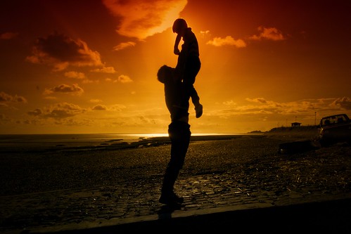
Me and my Dad by Pebbleheed, on Flickr

#2
Thumper

Thumper

    Nikonian

  • Forum Member
  • PipPipPipPipPipPipPipPip
  • 2,289 posts
  • Country Flag
  • LocationTexas

Site Supporter

(I had to look up chuffed to see what that meant as I am not familiar with that term.  :D  )


I rather like that shot.   Nice silhouette, nice colors. I don't know that I have the skill to grade it technically, but I know what I like, and that shot is pleasing to look at, for me.  


#3
Eagles1181

Eagles1181

    Forum Veteran

  • Forum Member
  • PipPipPipPipPipPipPip
  • 532 posts
  • LocationTexas

Personally I think it is a great shot.  


Eagle


#4
pebbleheed

pebbleheed

    Active Member

  • Forum Member
  • PipPipPipPip
  • 78 posts
Thanks both. Is there anything that stands out as a minus point or that you would change for the future?

Chuffed is a Yorkshire term by the way :D

#5
Merco_61

Merco_61

    Nikonian

  • Premium Member
  • PipPipPipPipPipPipPipPip
  • 10,630 posts
  • Country Flag
  • LocationUppsala, Sweden

Site Supporter

I like the silhouette and the colours. I, personally, find the car on the right distracting and would crop it out. A 5:4 crop gives the bonus of de-centering the composition a bit.


#6
pebbleheed

pebbleheed

    Active Member

  • Forum Member
  • PipPipPipPip
  • 78 posts
Thanks.

#7
Jerry_

Jerry_

    Nikonian

  • Forum Member
  • PipPipPipPipPipPipPipPip
  • 1,527 posts
  • Country Flag
I consider it a great capture.

Hard to improve, except for cropping.

Maybe - but only maybe - try to ligten slightly (!) around the legs.

#8
TBonz

TBonz

    Sportz Guy

  • Forum Member
  • PipPipPipPipPipPipPipPip
  • 3,652 posts
  • Country Flag
  • LocationOn A Field Somewhere...

Site Supporter

I think it is a great shot...cropping would probably improve it...i might even try a vertical crop to see how that worked...

#9
Ron

Ron

    Nikonian

  • Forum Member
  • PipPipPipPipPipPipPipPip
  • 2,260 posts
  • Country Flag
  • LocationMagic City

I also like this shot.... a lot! But then I'm a sucker for backlit photographs. I love the drama they impart to an image.


If I had to quibble about anything it would be the way the horizon seems ever so slightly tilted. No one else has mentioned this so it may be my imagination. Peter mentioned the car as being a distraction but frankly, until he pointed it out, I hadn't noticed it. The composition does a very good job of pulling the viewer's eye toward the subject. And, I like the current crop ratio. I suppose you might try to crop out the car and see how that works but I don't really think it's necessary. Maybe a vertical crop such as TBonz suggested. I think that would work better than a horizontal crop. 


Good job! 


--Ron


#10
etphoto

etphoto

    Loyal Member

  • Forum Member
  • PipPipPipPipPipPip
  • 229 posts
  • LocationCincinnati
A very nice shot and wish I had taken it. The colors are awesome. I don't like the car on the right. Either photoshop it out or crop. Very good shot.

ET

#11
TBonz

TBonz

    Sportz Guy

  • Forum Member
  • PipPipPipPipPipPipPipPip
  • 3,652 posts
  • Country Flag
  • LocationOn A Field Somewhere...

Site Supporter

I think the actual horizon is fine...I understand the point as there is a rise to the ground towards the right of the frame that can give that impression...
  • Ron likes this

#12
K-9

K-9

    Jamie

  • Forum Member
  • PipPipPipPipPipPipPip
  • 883 posts
  • Country Flag
  • LocationNew England

Site Supporter

Overall, a nice shot. If I were picky, I'd say the white horizon line crossing right through his mid section is more distracting to me than the car at the far right, which I feel adds a little substance to the otherwise flat and barren background.

#13
pebbleheed

pebbleheed

    Active Member

  • Forum Member
  • PipPipPipPip
  • 78 posts
Thanks all. Good to see others views on it.

#14
deano

deano

    Forum Veteran

  • Forum Member
  • PipPipPipPipPipPipPip
  • 960 posts
  • Country Flag
  • LocationColorado USA

Site Supporter

Also to me the car is distracting, but it can be cropped out.

Pleasing to look at.


#15
pebbleheed

pebbleheed

    Active Member

  • Forum Member
  • PipPipPipPip
  • 78 posts
I originally cropped the car out but I put it back in as I liked the reflection on the side of it and also felt it added something to the photo. Since then however I tried again without the car and it works better without it.

#16
deano

deano

    Forum Veteran

  • Forum Member
  • PipPipPipPipPipPipPip
  • 960 posts
  • Country Flag
  • LocationColorado USA

Site Supporter

It works either way, so what pleases you is more important.