Sign In
 Create Account
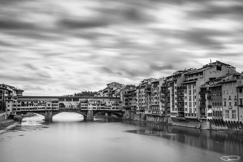
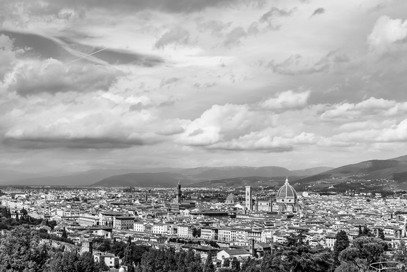
With a little help and guidance from Merco_61 and Bart I decided to convert some images to b&w. Everything was done in Lightroom. Please, let me know how to improve my images, what to correct, etc. I think I have not shared these images yet...


With a little help and guidance from Merco_61 and Bart I decided to convert some images to b&w. Everything was done in Lightroom. Please, let me know how to improve my images, what to correct, etc. I think I have not shared these images yet...

In the first one I feel the contrast might be a bit high and in the second I would use the adjustment brush on the trees in the foreground and lighten shadows and blacks slightly, otherwise your processing is nice as is the choice of subjects for monochrome renditions.
In the first one I feel the contrast might be a bit high and in the second I would use the adjustment brush on the trees in the foreground and lighten shadows and blacks slightly, otherwise your processing is nice as is the choice of subjects for monochrome renditions.
Thank you for your feedback!
I will try to improve #1. On second one I only used dark brush and now I see I should have used a bright one too.
Nikonian


Beautiful images that translate really well into b&w, Urban.
Thank you for you kind words, Bart! As I wrote yesterday, yours and Rob's photos were the inspiration 
Loyal Member

I'm liking these. I like images with a little punch (higher contrast), especially with B&W. I think images without the punch look flat. Its a personal preference thing I guess.
Thank you etphoto! I agree it's a personal preference. But I like all the feedback and different views I can get
I tend to like images with a bit more contrast - more with B&W than with color, but that's probably because the contrast is a bit more obvious in B&W. Very nice set Urban! I like the contrast in #1 but am thinking it could have used a very small bump in the exposure to bring out some of the darker areas or a touch less contrast...
Thank you for you feedback TBonz! Another great advice! I will upload corrected version later today. Got some really good advices already.
Much more consistent with the others. In darkroom terms it looks like a quite soft neg. copied on a harder than medium paper. The punch is still there, but the shadows aren't so overpowering. Nice work!
Thank you, Peter! I like the last one as well. And I also like the way the others have turned out. I need to convert some more images to b&w . It is a very nice PP technique and now I see you can get more dramatic effect that way. I really appreciate everyone's advice and feedback! Now I need to improve #2.
Nikonian
Agreed in how your second version is more in line with the rest of the set.
The perspective correction works well too - not that this is b&w related
Looking forward to more of your b&w work, Urban!
Thank you Bart! I will share more images as soon as they are ready. And thanks for all the help!


 Back to top
 Report